OpenBuildings™ Designer Help

Place Railing

Used to create both handrails and guardrails in the same assembly.

Note: Placement is completed using the controls found on the Placement ribbon tab and the Property Panel which is loaded with the active Building element catalog items and properties.
Accessed from:


  • Ribbon: Building Design > Architectural > Place Architectural Elements > Railing split button > Railing
Tip: You can create railings that follow the slope of a stair. In addition creating and placing handrail assemblies, you can:
  • Create and place railings that contain both handrails and guard rails in egress stairs.
  • Create and place railings that contain both handrails and guard rails along ramps.
  • Place guardrails along mezzanine and other floor openings.
  • Place handrails along a wall; along the outside of a stair tower; and along a corridor.

Railing components


Rails – the horizontal elements of a railing. Some common uses for rails are:
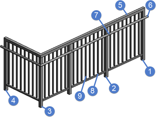
  • Guard Rail (5) – the upper most rail, usually installed at a height of 42 inches. Guard rails are required over any kind of floor opening in the US.
  • Hand Rail (6) – the rail, usually installed two inches from the wall, that is held by a person walking beside the railing.

    The height of a handrail is measured vertically from the floor to the top of the railing. For handrails that are associated with a stair, the height is measured vertically from the front edge of the stair to the top of the railing.

  • Bottom Rail (8) – the lower most rail that is connected to the upper rail by balusters.
  • Kick Plate (not illustrated) – a solid plate along the bottom of a railing, usually to prevent small objects from falling off the edge of an opening.
Rail Supports – Vertical elements that hold the railing in place. Rail Supports fall into two categories:
  • Posts (1, 2, 3, 4) – the major vertical elements of a railing that connect the assembly to the stair or floor. Posts normally repeat in a pattern every four to eight feet, measured center-to-center.
  • Mounting brackets (7) – fittings that attach handrails to the wall, or to the posts.
Balusters (9) – the minor vertical elements of a railing that tie the various rails together. These are normally placed every four inches, measured center-to-center. Ends (not illustrated) – cells can be attached to the end of the railings to create custom decorative and functional conditions.

Placement tab

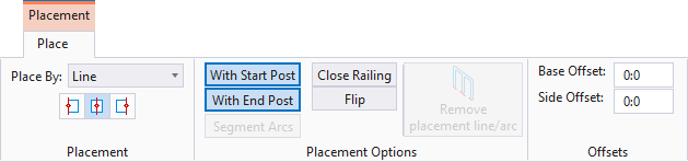
Select Place Railing also opens the Placement contextual ribbon tab which is used to control the physical placement and positioning of newly placed railings.


Note: The Placement tab opens on the ribbon when placing Building elements. The Placement tab contains settings specific to the Building element being placed that are used to define the position, orientation or dimensions of the Building element being placed. Also available on the Placement tab, are a collection of Building common tools selected specifically because of their relevance to the Building element being placed.
SettingDescription
Place By: The following options are available for placing railings:
  • Line — Select this option to place a railing by entering data points forming a line string.
  • Arc - By Center — Select this option to place a railing by entering data points for a start point, a center point and an end point forming an arc shape.
  • Arc - By Edge — Select this option to place a railing by entering data points for a start point, an arc edge point and an end point forming an arc shape.
  • From Line — Select this icon to place a railing by selecting an existing line/arc string.
  • From Stair — Select this icon to place a railing by selecting an existing stair. You are prompted to select the right or left side of the stair.
  • From Slab — Select this icon to place a railing by selecting an existing slab. You are prompted for a start and end point. The tool automatically selects the edges around the perimeter of the slab. The start/end point selections allow you to control how much of the edge has a handrail applied adding gaps where there is no handrail. Reset (right mouse click) to bypass the start/end point selection and generate a railing around the entire slab perimeter.
Tip: Switch between the Line, Arc - By Center, and Arc - By Edge Place By options during placement to achieve railings with both straight and curved sections.
Alignment icons The following options are available for aligning railings:
  • Left Alignment — the railing places to the left of the creation line.
  • Center Alignment — the railing is centered upon the creation line.
  • Right Alignment — the railing places to the right of the creation line.
With Start Post When on (highlighted), the railing is placed with a post at the start of the railing. When off, the railing is placed without a post at the start of the railing.
With End Post When on (highlighted), the railing is placed with a post at the end of the railing. When off, the railing is placed without a post at the end of the railing.
Segmented Arcs When on (highlighted), curved railing sections are placed with segmented straight sections along the curved paths. When off, curved railing sections are placed with smooth individual sections along the curved paths.
Close Railing When on, a Reset click adds a railing from the start point of the railing to the end point of the last railing, to form an enclosed area. Enabled for the Linear and Arc placement options.
Flip Flips the railing about the placement line.
Remove placement line/arc Deletes line/arc construction elements used to place railings. Enabled when Place By: From Line placement mode is activated.
Base Offset Sets the Z axis distance between the elevation of the active floor and the elevation of the item being placed (usually the bottom surface). Base Offset can be a negative value.
Side Offset Sets an offset distance from the placement points or selected elements to generate railings from.
Note: During placement, you are prompted upon reset to select one side of the drawn profile to generate the railing on. A dashed offset railing profile is dynamically displayed as you hover over the drawn profile until you enter a data point (to select a side).

Railing Properties


SettingDescription
Catalog Type Selector Used to select from available Catalog Types. Selections made here updates the Catalog Item Selector combo box.
Catalog Item Selector Used to select from available Catalog Items. The Catalog Item Selector combo box contains several options and settings designed to make it easier to find the exact catalog item you need to place/change.

A generic example of Catalog Item selector options for searching, grouping and navigating

The Catalog Item list also includes user defined assemblies, and RFA catalog items, if any.
  • Search - Used to search for catalog items by name. Results are dynamically updated in the catalog items list. The searched text is also highlighted in the results.
  • Group By: - Used to list catalog items in groups based on values assigned to specific catalog item properties. Groups can be collapsed and expanded by clicking the down/up arrows on the group name headers. For instance, selecting Group By: > Type for a wall catalog type creates groupings with Schematic, Partition, WallComponent, etc headings. Catalog items which have Type defined as Schematic, Partition, or WallComponent will be listed under those headings. You can also select Group By: > Do Not Group to create a flat list with no grouping. (Exemption Mechanical).
  • (Large Icons) - Displays a representative icon for each catalog item listing.
  • (List) - Displays catalog item listings without any icons.
  • (Float) - When selected, the Catalog Item Selector combo box is detached from the placement/modify dialog, and becomes a separate dialog. You may prefer to have the floated dialog docked and always open over clicking the Catalog Item Selector in the placement/modify dialog for each catalog item selection.
    Note: The main dialog remains open and refreshes the thumbnail and preview in response to the selected catalog item.
    Click the Dock icon to close the floated dialog.
  • Recently Used - Lists catalog items that were recently selected in a "Group". This is useful because when you need to repeatedly place or modify the same catalog items, you do not need to repeatedly browse or search the main catalog items list.
Note: When you make your catalog item selection, it becomes the active part the Family/Part Toolbar.
Catalog Tools A split button located to the right of the Catalog Item Selector contains tools to assist with managing catalog data prior to placement of selected catalog items.
  • ( Match Element Properties) - Sets the current active placement/modify dialog settings to match the parameters of an existing, selected catalog item instance in the model. This saves a good amount of time when placing catalog items that need to identically match those that already exist.
    Note: The existing catalog item instance must be of the same catalog type selected with the Catalog Item Selector for the parameters to be matched.
  • (Reset to Defaults) - Resets the selected catalog item property values to the default state as defined in the catalog library.
  • (Edit Catalog Item) - Used to edit the selected catalog item. Opens the Catalog Editor, where you can create and edit new catalog types and catalog items. Catalog Editor can also be used to edit existing data and to view catalog item instance properties and values by definition.
  • (Catalog Item Manager) - Used to manage catalog items library into organizational dataset. Opens the Catalog Item Manager, where you can copy or move catalog items into the dataset, and promoting current catalog items by moving then across workset levels.
  • (Save Catalog Item) - Updates the active catalog item in the DataGroup System catalog library with the values currently shown in the Properties list box permanently changing the defaults for the catalog item.
  • (Save Catalog Item As...) - Used to save a copy of the selected catalog item as another catalog item (the default name adds the prefix " Copy of " <current catalog items name>). Opens the Save As dialog where catalog item definitions can be named before saving them to the DataGroup System.
  • (Load Railing Settings) - Opens the Railing Construction Settings which is used to set the shape, size, placement, and appearance of all elements and components that are contained in the railing assembly.
Note: The Save Catalog Item and Save Catalog Item As... tools perform administrative tasks on DataGroup System catalogs. Administrators and users may want to hide the tool icons to avoid incidental or unwanted changes to their firm's dataset by setting the user configuration variables BB_CATALOGITEM_ADMIN_IN_PLACECMDS and BB_CATALOGITEM_SAVEAS_IN_PLACECMDS to "0", respectively.
Preview Displays the selected catalog item in the preview window. This display changes and the preview updates as various options are chosen. The preview also changes dynamically with some of the prominent settings on the Placement tab, e.g Height, Rotation angle, etc. A right-click in the Preview opens a Show/Hide Viewing Tools option menu:
  • Zoom In - Zooms in about center of preview.
  • Zoom Out - Zooms out about center of preview.
  • Pan - Moves the preview following the pointer. Click again to stop panning.
  • Fit - Fits the object to the extents of the preview.
  • Rotation - Sets the orientation of the selected item in the preview to one of the standard orientation options:
    • Isometric
    • Right Isometric
    • Top
    • Bottom
    • Left
    • Right
    • Front
    • Rear
  • Display Mode - Sets the display of the selected item in the preview to one of the standard display modes.
    • Solid
    • Wire Frame
    • Visible Edge
    • Filled Visible Edge
For Place workflow, the Hide/Show Preview controls displaying preview of the element currently selected for placement.
Properties list - toolbar Used to manage catalog item properties during placement or modification. Catalog item properties define the catalog item instance in the model, and are accountable in the DataGroup System data management tools. You can place a catalog item with its default property values or you can change property values as needed, place an instance in the model, and optionally save the changes to the catalog.

The Properties combo box contains tools for sorting and searching the properties list:

  • (Categorize) - When on, catalog item properties are grouped in categories based on the catalog type definitions. When off, the properties are listed alphabetically without grouping.
  • (Alphabetical) - When on, catalog item properties are listed alphabetically without grouping. When off, the properties are listed in categories.
  • (Description) - Toggles a description field at the bottom of the placement dialog listing information about the highlighted catalog item property. The information listed includes the property definition display name, internal name, and type definition.
  • Search - Used to search for catalog item properties by name. Results are dynamically updated in the properties list.
Railing Parameters
  • Part Definition - Sets the part definition for the railing.
  • Generate Drawing Symbol - When set to on, a drawing symbol is generated. When set to off, the drawing symbol is not generated.
Construction Phase Lists design and construction phase properties for walls such as New Construction, Future Construction, and Items to be Moved.
Identification Lists identification properties for the active catalog item type.
IFC Override Lists IFC properties not automatically mapped to DataGroup System properties that can be manipulated for export.
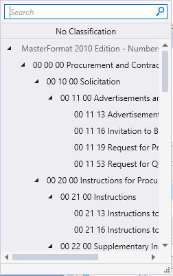
Classification Building Classification Systems are supported by the DataGroup System. MasterFormat, OmniClass, and UniFormat property values can be associated with any Building element. Click the Value cell to open the Classification System selection combo box. The combo box is populated with selected classification system property values. It can be resized by clicking on the combo box's bottom right corner. Search for properties by name. Search results are displayed in the classifications hierarchy. Double click a property to select it. This action also closes the selection menu. The selected property displays in the selected classification system property value (on the Properties list).


Note: Information in the Value column rows can be completed by selecting the applicable cell to activate an editor field, an option menu, or a pop up dialog. This data is written to the element properties. Properties displayed with grey text are read only. Some of these are set in the placement tool's Placement tab, and can be modified there. The dividing bar between the Property, and Value columns can be moved to change the width of either area, or resize the dialog. A vertical and horizontal scroll bars are available to scroll and adjust Properties panel viewing and the display of data.
Key-in: TFPLACE RAILING [ Catalog_Item ]

Use the Catalog_Item argument to directly key-in the desired catalog item saved in the active DataGroup System catalog to pre-populate the tool settings. For instance TFPLACE RAILING Pipe Railing where Pipe Railing is the catalog item name.

Note: The Catalog_Item argument is case sensitive. Be sure to key it in exactly as it appears in the catalog.